Friday, December 31, 2010

Yahoo! I finally got the right combination of e-mail address and password to get back into my blog. And you thought I was missing in action.

I've been involved in Artworks Holiday Gallery during the holiday season. This is the third year for the gallery, but my first year as director. What a joy, what a challenge, what a blessing!

The gallery is a co-op of 25 artists from the Fort Wayne area, open only November 1 through January 7. The artists each have their own space in the gallery, which is located in a vacant storefront in the nicest mall in town.

A portion of the proceeds go to benefit Mad Anthonys Children's Hope House, (think Ronald McDonald House on a regional scale).


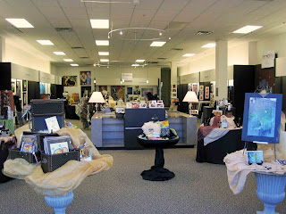
This is a front view on opening day November 1, 2010. The space is 3500 square feet of beautiful open space devoted to the work of local artists.


Each artist works a minimum of 10 hours a week in the gallery. Some serve on the marketing and promotions team, others freshen displays, plan events, etc. Everyone works the front desk, greeting visitors and explaining our relationship to Mad Anthonys Children's Hope House.


The artwork is juried by a governing board and work is selected to represent a variety of media, with the goal of complimenting the work of others, without being in competition.


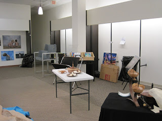
This is what the space looked like during set-up. It looked like a lot of open space and I thought we'd never fill it up. Silly me!


Since we are in the space for such a short time, the aluminum tree came down the day after Christmas and we created a bright springy look that is in great contrast to the other stores, still resplendent with holiday decorations. What an eye-catcher!

This is to the left of the front door.

This is to the right of the front door. The big poofy flowers are made from tissue paper. Remember making those as a kid? It works on large scale, too!

The glass dulls the color some. This is how vivid the colors are in real life.

So, welcome back to Muttonhead world. This time, I've updated the user name and password and written them down so I can get into this blog again!! Sigh! Isn't technology wonderful?
Monday, July 19, 2010

What is it about a ripe wheat field that captures my imagination?

I love to see the wind rippling through the field, teasing the dancing heads of grain and causing a wave of color change.

The fragrance of the mowed wheat sticks in my memory, bringing with it a host of childhood memories of driving along country roads with my parents.

On the drive home from the Midwest Fiber and Folk Art Fair today, I got off the highway and took a side road. My reward was this scene of newly mown wheat. It made me smile.

What small miracle did you find today?

Sunday, July 4, 2010

Art Blast in Syracuse, Indiana yesterday was, well, a blast! There were about 20 vendors located in and around The Creative Fish Gallery. There was a steady stream of friendly folks visiting and shopping all day!

Can you believe all this (except the refrigerator box) fit in my little Vibe? LOVE the Vibe! It doesn't look big, but with the seats folded down, there is continuous cargo space from dashboard to hatch AND it gets 30 mpg hauling all that stuff. Amazing!


Teacup "Candle-ier" was once again the subject of much discussion.


Two Sipsters Studio jewelry drew a lot of attention.


As did the Re-Chic Boutique items. (Yes the baker's rack folds flat and fit into the Vibe!)


A set of three serving pieces in graduated sizes. The delicate roses on the Noritake N78 (or was it N73) are really an eye-catcher.


This set of four ivy servers in graduated heights is beautiful on a table for any special occasion.


Kids and adults alike were drawn to the "spray-dye it yourself" booth. Select a blank, such as a cotton T-shirt, silk scarf, or rayon waterfall jacket and apply spray dyes in our special booth (formerly known as the refrigerator box).


This is a cotton top I made for Lori in our favorite colors, purple (her favorite) and orange (my favorite).

There were children as young as 7 having a great time spraying the colors onto the shirts. The sun dried the blanks quickly and they went home for heat-setting the next day.


All the color was from Earth Safe Finishes, of course! Safe for the environment; safe for the artist. It took only two droppers full of Colorant + 1 dropper full of Fabric Magic in about 16 ounces of water. Gotta love it!! http://www.earthsafefinishes.com

We'll be back for Art Fest in Syracuse at the end of the month—or our work is in The Creative Fish in Syracuse. Drop by on your way to or from Lake Wawasee!!

Thursday, July 1, 2010

I'm excited to announce my first fabric collection has debuted with Avlyn fabrics!!! It was previewed in their booth at Quilt Market in May and is now appearing on their blog and Facebook page.

Here's a link to the Facebook page, if you'd like to see it:

Designing fabric has been a dream of mine since age 7. So, say a prayer that fabric buyers will love it and it will actually become printed fabric! If it does, the fabrics should be in stores in January 2011.

Yee Ha!

Monday, June 28, 2010

I spent last Thursday and Friday at the Shipshewana Quilt Festival in Shipshewana, Indiana. Thursday was six wild hours of schoolhouse presentations and Friday was filled with a wonderful Altered Photo Artistry workshop, based on the two books C&T has published on the technique.

Participants send a photo to us a week or so before the workshop. We alter the photo, enlarge it, and print it on fabric so it’s ready for participants to work on in class.

This is Sharon from South Bend. Her photo was taken on a tropical vacation. She said she had to touch the blossom to confirm it was real. (I suspect it is a bromeliad, but can't identify the type.)


This close-up shows the texture she is adding with the stitching.


Ruth's photo is lost in the ethernet somewhere, but she was a great sport and agreed to work on one of my photos. She and friend Linda Davidge came all the way from Florida!


Ruth's outlining really adds definition to the rose's petals.


Mary had quite a challenge with this hydrangea. I didn't realize she had chosen it, or I would have suggested a blossom with fewer elements to outline. The fun really begins when you start to add the colors!


Mary outlined the hydrangea head and began adding yummy texture with a plum-colored thread in the shadow areas. If she changes her mind, she can outline the units any time before finishing the piece.


Linda Elder had made only two quilts before this workshop, but her extensive experience in dyeing and painting fabric certainly was an asset!

The way she stitched the stairs and plaster walls really created a contrast in the design elements. Linda is considering adding some beads on the floral bush on the left side of the stairs. That would really add another dimension to the composition.


Linda Davidge's photo was on my hard drive, but through a mix-up wasn't printed and ready for her to stitch on in class. (We did print it out and it's ready for her to use when she gets home. Can't wait to see what you do with the barn photo, Linda!!)

The purple glads were from the farmer's market last year.


Kathy Branigan's photo of an hibiscus presented two additional challenges. The edges of the petals, stamen, and pistils have areas that are not easy to see. She had to make educated decisions about the outlining in those areas.

This close-up shows she did a good job of adding definition where there was little or none. Who knew college botony class would come in handy all these years later?


Jean Perrenod chose a photo of a lovely tulip, in her favorite color. She got a late start on this piece because the printer (not the printer operator, of course) printed three of one quadrant and one of another, which made a rather abstract composition. Actually, that might be fun some time. I'll have to try it!


You can see, Jean has just begun to stitch texture in the bottom right quadrant of the tulip. This will be striking when the stitching is complete!

Holly McMurtrey chose one of my favorite flowers, the iris. It was pretty peachy in the original photo, but we convinced it to be pink. She chose to outline some of the leaves, as well as the blossom, to add to the depth of the image.


Can you see the different stitching patterns she chose to separate the background, leaves, and petals of the iris?

Good job ladies!! Thank you so much for allowing Lori and I to share this fun technique!


Monday, June 21, 2010


It all began so innocently. I needed a how-to for an upcoming book project about recycling and up-cycling. I've been making these tea cup "candle-iers" for several years and love making them, but it wasn't my original concept.


The one above is a birthday gift for my "Sipster" Lori. It's made from teacups that belonged to my mom. Lori and my mom had a special bond and I knew she would enjoy this memento.


It all snowballed from there!

A trip to local thrift stores netted several partial sets of beautiful old tableware, much too pretty to never be used again! So, I started combining berry bowls with old sherbets, fruit cups, and candle holders to create soap dishes, such as the one above.


If you don't know me, my design motto seems to be "nothing succeeds like excess." Within minutes, the concept grew to include cupcake servers, such as the one above.


A beautiful clear-glass plate and an old sundae dish turned into this!


A rectangular decorative dish and another candle holder turned into this adorable potpourri holder.


Isn't this beautiful? It's now a footed cake plate with a base that was an old light fixture globe.


Another cake plate with an iridescent sherbet as a base.


These are Noritake from 1940! Carefully selected bases placed these serving bowls at different heights.

Ditto on these butter plates.


And these translucent teacups that now function as candle holders.


Depression glass! Who can leave out depression glass?


Where will it all end? I now have approximately 50 pieces of these beautiful pieces. I'm now have to open an online shop. There is no more room in my china cabinet!!

Can you recommend a good online e-commerce site?

Sunday, June 20, 2010


Photos of my 12 newest pieces, hanging in the Johnsons of Madrid Gallery in Madrid, New Mexico.

Thank you so much to Meg Lamley and her DH Leonard Nuttall of Albequerque, NM. They visited the gallery and Leonard took these wonderful photos so we could all see them hanging in the gallery.

If you've never been to Madrid, it's quite an experience!! It's along the Turquoise Trail in New Mexico and is/was a mining town. Johnsons of Madrid is located at the southern edge of town (only one road through town and no stop lights), across from the entrance to the mine.


Diane Johnson and her husband moved to Madrid in the 1970s, when it was essentially a group of deserted houses. Now, it's a wonderfully quirky town with restaurants, shops, and galleries.


It's the only place I've ever been where their Halloween parade included children, parents, and pets—including a baby yak! (No kidding!)

The gallery has beautiful paintings, photography, sculpture, art wear, and an occasional art quilt. If you're in the area, make a side trip. It's really a lot of fun!