I spent last Thursday and Friday at the Shipshewana Quilt Festival in Shipshewana, Indiana. Thursday was six wild hours of schoolhouse presentations and Friday was filled with a wonderful Altered Photo Artistry workshop, based on the two books C&T has published on the technique.
 Participants send a photo to us a week or so before the workshop. We alter the photo, enlarge it, and print it on fabric so it’s ready for participants to work on in class.
This is Sharon from South Bend. Her photo was taken on a tropical vacation. She said she had to touch the blossom to confirm it was real. (I suspect it is a bromeliad, but can't identify the type.)


 The way she stitched the stairs and plaster walls really created a contrast in the design elements. Linda is considering adding some beads on the floral bush on the left side of the stairs. That would really add another dimension to the composition.
 Linda Davidge's photo was on my hard drive, but through a mix-up wasn't printed and ready for her to stitch on in class. (We did print it out and it's ready for her to use when she gets home. Can't wait to see what you do with the barn photo, Linda!!)
 The purple glads were from the farmer's market last year.

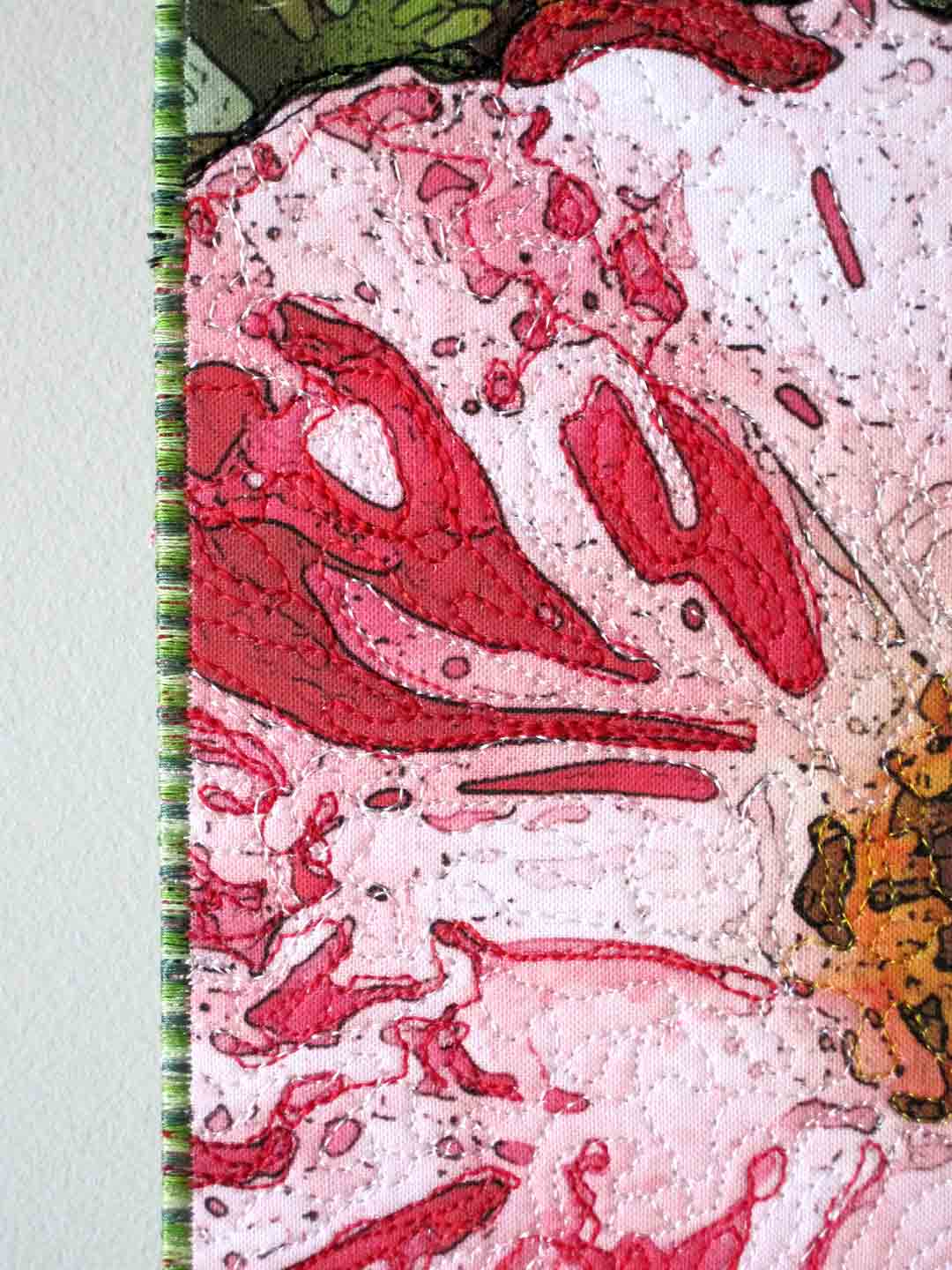
 This close-up shows she did a good job of adding definition where there was little or none. Who knew college botony class would come in handy all these years later?


 Holly McMurtrey chose one of my favorite flowers, the iris. It was pretty peachy in the original photo, but we convinced it to be pink. She chose to outline some of the leaves, as well as the blossom, to add to the depth of the image.


This close-up shows the texture she is adding with the stitching.

Ruth's photo is lost in the ethernet somewhere, but she was a great sport and agreed to work on one of my photos. She and friend Linda Davidge came all the way from Florida!

Ruth's outlining really adds definition to the rose's petals.

Mary had quite a challenge with this hydrangea. I didn't realize she had chosen it, or I would have suggested a blossom with fewer elements to outline. The fun really begins when you start to add the colors!

Mary outlined the hydrangea head and began adding yummy texture with a plum-colored thread in the shadow areas. If she changes her mind, she can outline the units any time before finishing the piece.

Linda Elder had made only two quilts before this workshop, but her extensive experience in dyeing and painting fabric certainly was an asset!
 The way she stitched the stairs and plaster walls really created a contrast in the design elements. Linda is considering adding some beads on the floral bush on the left side of the stairs. That would really add another dimension to the composition.
 Linda Davidge's photo was on my hard drive, but through a mix-up wasn't printed and ready for her to stitch on in class. (We did print it out and it's ready for her to use when she gets home. Can't wait to see what you do with the barn photo, Linda!!)
 The purple glads were from the farmer's market last year.
Kathy Branigan's photo of an hibiscus presented two additional challenges. The edges of the petals, stamen, and pistils have areas that are not easy to see. She had to make educated decisions about the outlining in those areas.
 This close-up shows she did a good job of adding definition where there was little or none. Who knew college botony class would come in handy all these years later?
Jean Perrenod chose a photo of a lovely tulip, in her favorite color. She got a late start on this piece because the printer (not the printer operator, of course) printed three of one quadrant and one of another, which made a rather abstract composition. Actually, that might be fun some time. I'll have to try it!

You can see, Jean has just begun to stitch texture in the bottom right quadrant of the tulip. This will be striking when the stitching is complete!
 Holly McMurtrey chose one of my favorite flowers, the iris. It was pretty peachy in the original photo, but we convinced it to be pink. She chose to outline some of the leaves, as well as the blossom, to add to the depth of the image.
Can you see the different stitching patterns she chose to separate the background, leaves, and petals of the iris?
Good job ladies!! Thank you so much for allowing Lori and I to share this fun technique!


 T
T